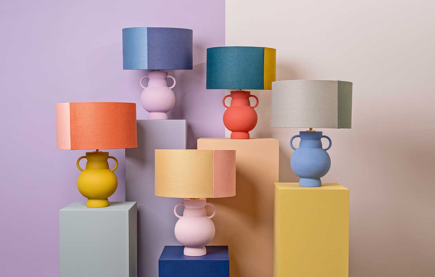
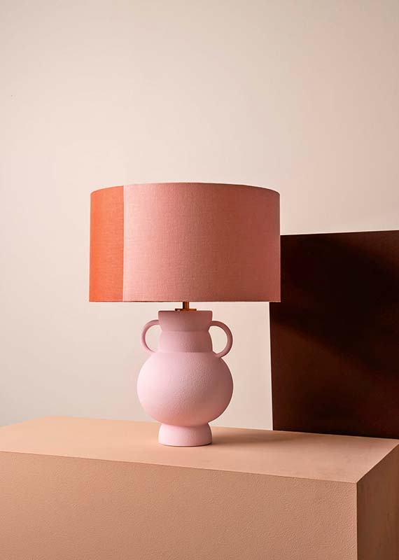
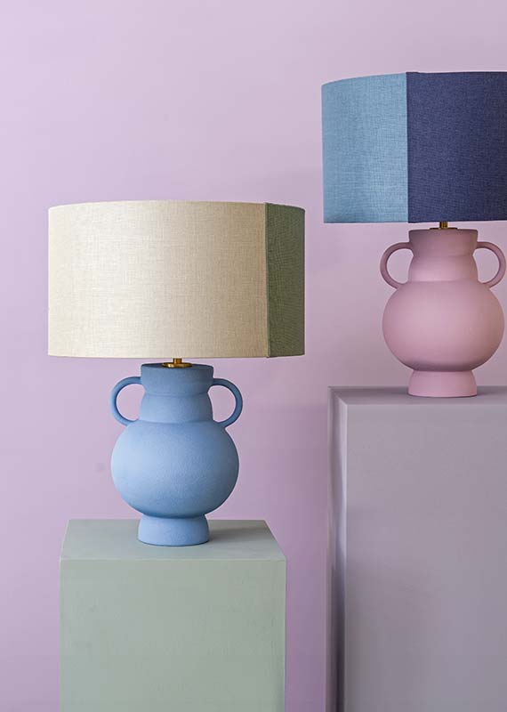
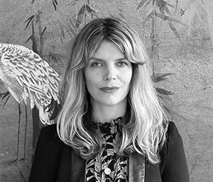
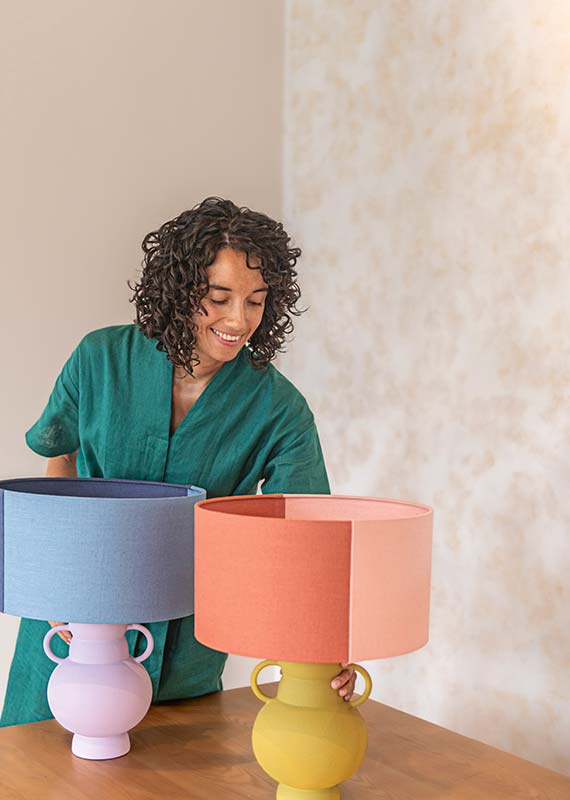
The interiors writer and colour visionary discusses her vibrant journey through design, her dynamic personal style, and the inspiration behind her dusk-inspired lamp collection, an exciting new collab with Heathfield & Co
 Amy Moorea-Wong
How did you get into interiors?
After studying Fine Art at university, I went on to write about design for interiors magazines such as ELLE Decoration and Livingetc for over a decade before writing my book Kaleidoscope: Modern Homes in Every Colour, which explores playful, unexpected ways to bring a bit more brightness indoors. Interior design has always intrigued me – I see it as a unique opportunity to express ourselves on a large scale. How you dress the space you live and relax in is such a representation of your personality, and walls, floors, ceilings and everything in between are a way to visually showcase yourself. It’s such an exciting opportunity for creativity, one we should make the most of!
How would you describe your own interiors style?
My style is ever changing, which is something I embrace. At the moment I’m into combining pops of brightness with natural hues and materials, it’s a nice balance. Art is a must for me, my walls are covered and I’m forever framing the next piece. My motto is: take the risk and go for the colour. It brings such joy and transforms a room into a space you actively enjoy spending time in. What inspired the Dusk table lamp collection? I based the palette around dusk – it’s such an evocative time of the day, it feels almost ethereal with colours warping and completely changing; subtle or exultant hues appearing briefly before fading into darkness. All of this lasts only moments and often we barely notice it. I wanted to capture the smoky, hazy, dreamlike tones that emerge as the sun starts to sink and set them against the darker, moodier colours that materialise mere seconds later, without forgetting the pops of more surprising hues that occasionally flash by. The colours are natural but bold, they’re soothing with the odd shot of intensity and can blend together smoothly and softy, or create jolts of juxtaposition.
What’s the best way for homemakers to introduce colour if they’re hesitant?
Absolutely with small objects. Pieces such as cushions, throws, decorative accessories, and lovely pieces of lighting are all easy to move if you change your mind, and you can have a lot of fun trialling combining colours and finding out which kind of palette works for you without hugely committing to a palette. Then you can move on to larger items before getting into paint. Colour in interiors is a wonderful, soul-enriching thing. Start with shades you instinctively like, even if you think they won’t fit in – take a risk! It’ll boost your mood and make your home a more joyful place to be.
How can you use colour to create a cohesive design across multiple rooms or spaces?
One thing I like to have is a shade that pops up in multiple spaces throughout the home, pulling it together like a thread. Perhaps it’s a paint colour in one room, then it appears in a piece of art somewhere else, a cushion somewhere else, then just as you were forgetting about it, there it is on a rug, peeking out to say hello and narrating the story of the home.
How can colour affect mood in the home?
It’s such a personal thing. For me, in my brights phase, when I casually walk past the shades and combinations I’ve selected for my home they give me a mood boost and make me feel content. When I step back to take the whole space in, I feel both happy and invigorated as well as totally calm, it’s like I’m looking at a part of myself – I’m completely at home.
