Nothing says summer like a fresh lick of paint. And while seasonal trends come and go, this year it’s all about finding those shades that strike a balance between optimism and calm. From buttery yellows to grounding greens and terracotta tones that bring the warmth (even if the weather doesn’t), it’s never been easier to add colour with confidence. The trick? Think in layers – build your palette with the same thought you’d give to an outfit, combining contrast, texture and tone.
 Farrow & Ball
At
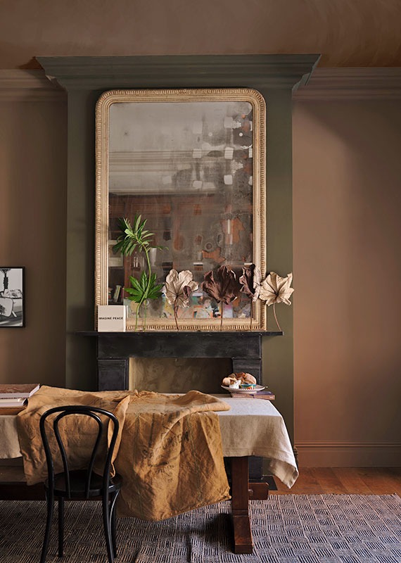
Farrow & Ball, colour is a slow burn – the kind of rich, lived-in hue that doesn’t need shouting about. The heritage paint brand has just introduced 12 new shades to its signature palette, from earthy clays to crisp sky blues. Nine are brand new; three are carefully chosen revivals from the archives. And while the colours may span quite a spectrum, they’re all rooted in the everyday.
“Over the last few years, we’ve relished living with colour,” says Joa Studholme, Farrow & Ball’s colour curator. “It’s opened our eyes to all the shades surrounding us, which we often don’t think about. The treasures right under our noses. Now, we’re ready to embrace more colour and celebrate these unsung heroes in our homes.”
It’s a comforting sentiment, and one that comes through in the brand’s new hero shades. Marmelo, for instance, is an orange-tinged terracotta that takes its cue from the marmelo quince – the fruit behind marmalade. “Who could fail to be comforted by that familiar orange reminiscent of warm, buttered toast and conversations around the breakfast table?” Joa argues. Another favourite is Douter, a deep, complex green inspired by the soot and tarnished brass of old candle snuffers. “It sits somewhere between Inchyra Blue and Green Smoke,” says Joa. “I always think candlelight brings a magical quality, whether it’s a dinner party or just a cosy evening in.”
Even the neutral tones come with character: Sizing is a crisp Farrow & Ball take on off-white with a hint of blue, while Reduced Green is one of those elusive shades that changes with the light – sometimes olive, sometimes brown, but always grounded. From the archive, the reissued Sap Green is worth noting, too. Rich and warm, it boasts an olive tone that makes a small room feel more inviting than enclosed.
“I love delving into our archive,” says Charlotte Cosby, creative director at Farrow & Ball. “There are some real treasures tucked away in there and I’m thrilled these three are getting another turn in the spotlight.”
 Lick (@sarahmulkerrinstv)
At
Lick, the approach to colour is a little more contemporary, but just as thoughtful. Tash Bradley, the brand’s director of interior design, has noticed a shift in how clients are embracing colour. “They’re leaning into those richer tones but still pairing them with lighter, softer shades,” she explains. One of her current go-to pairings is Lick Supreme Red 06 with Blue 02 or Blue 03 – a classic wine red set against soft, warm blue-greens. “These blues are light and airy with a warm undertone, and when you bring in that deeper red, it just instantly elevates the whole space,” she says. “What’s great is how versatile it is – the blue takes the lead as the main colour, and then you layer in the richness of that red in smaller moments. Think colour drenching in blue, and then adding the red accents on the inside of cupboard doors, upcycled furniture, or soft furnishings which brings such a lovely balance.”
Yellow, too, is making a quiet return. Not the sugary shades of the past, but something a little more considered. “Yellow is well and truly back, but in a much more refi ned way,” says Tash. “Lick Supreme in Yellow 07, for example, works beautifully in any room direction. It has grey and brown undertones that give it a more premium, grounded feel and it’s warm without being sickly.” Pair it with dark-toned wood for a sophisticated finish.
 Earthborn
Earthborn, meanwhile, brings a wholesome edge to the conversation. Known for their eco-friendly credentials and soft, chalky finishes, they’ve become a go-to for anyone after a gentler take on colour. Interior stylists Maxine Brady and Gemma Gear – also hosts of the How to Home podcast – are keen advocates.
“I love ‘The Lido’ from Earthborn, which is a bright and bold shade of teal,” says Maxine. “It reminds me of Brighton’s coast – it’s a fresh and zingy! A lot of the promenade is painted this shade; it makes me smile and reminds me of home.”
For Gemma, green still reigns supreme. “Green has to be my favourite colour… it’s incredibly versatile and instantly brings a sense of calm and freshness to a space,” she says. Her go-to is Earthborn’s Cricket, a vibrant but grounded shade that works Yellow gets a mention here, too. “Daisy Chain is a gorgeous, cheerful yellow that radiates warmth,” says Gemma. “I’ve currently got my eye on it for an upcycling project I’m planning soon. Buttery yellows also continue to be a hot trend for summer 2025 – they add warmth without being too bold.”
For those wanting to go further, Earthborn’s eco-friendly paints lend themselves to more creative applications. “I’d say colour and pattern are probably the most important factors in creating that sunshine feeling in our homes,” Gemma adds. “Can-Can is a rich, playful red that adds energy and personality to any room, and is perfect for creating bold, playful patterns.”
So whether you’re looking to revamp an entire room or just add a dash of colour to an alcove, the message is clear: summer is the season to be playful. With so many nuanced shades to choose from, the biggest challenge may be knowing where to stop. But that’s part of the fun. As the colour experts all agree, it’s less about following trends and more about embracing what makes you feel good – whether that’s a whisper of dusty blue, a full wall of marmalade orange, or just a cheerful flash of daisy yellow on your favourite chair legs.

By Ali Howard
Fabric Magazine Contributor