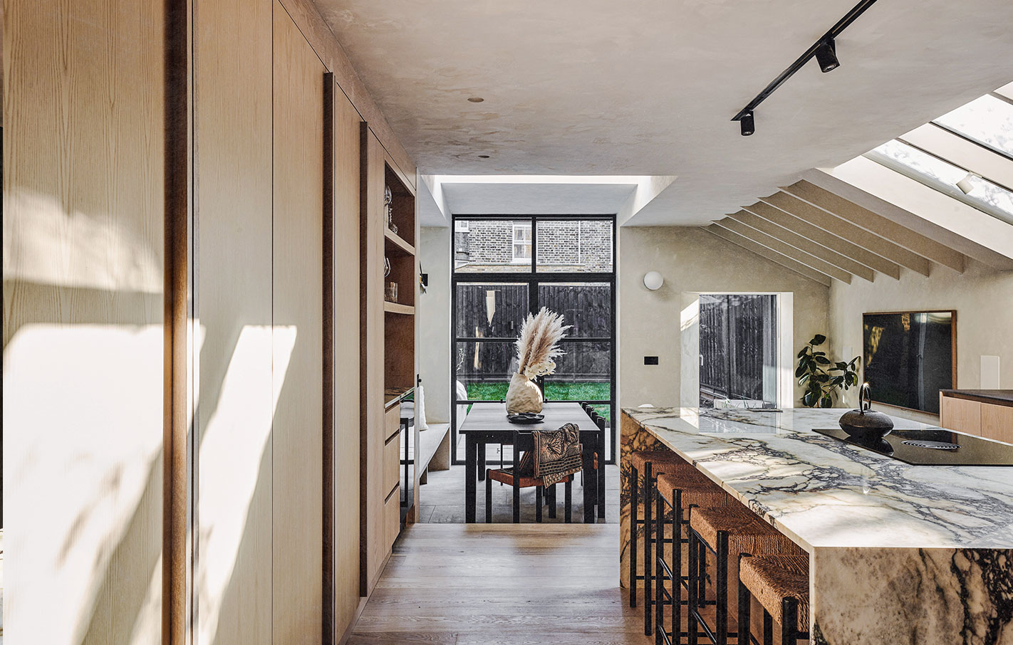
With its blend of organic materials and abundance of natural daylight, this Victorian terrace has seen a bold, contemporary update that really flows
 Elliot and Amy worked with Rees Architects to give their London terrace a bold, contemporary update
It’s hard to imagine Elliot and Amy’s home in its previous incarnation, such is the success of the renovation. The young couple enlisted London-based Rees Architects to create an ambitious ground floor rear extension that would transform the property into a design-led, contemporary home that celebrates light and space – whilst maintaining elements of its original period charm. Built in 1895, it was a classic Victorian terrace, and by all accounts, needed some TLC when the pair took it on in 2021. Elliot describes the house then as “liveable, not a complete wreck, but the bathrooms hadn’t been updated since the mid- 2000s, and the kitchen looked like it was from the ’90s – warped vinyl flooring, holes under the skirting filled in with wire wool (to keep rats out!), horrible laminate cupboards with child locks on each door…” It’s fair to say the kitchen has been reconfigured beyond recognition.
Elliot, CFO for Palace Skateboards and Amy, who does legal for JW Anderson, came to the architecture practice with a clear brief: along with a top-to-toe redecoration, they wanted a bespoke extension that would maximise kitchen and dining spaces; a reconfigured bathroom; and a designated utility area that would double up as a cosy nook for their two lively dachshunds. In what was once a dark and dysfunctional middle room sits a built-in dog crate underneath bespoke joinery, while noisy appliances are kept away from the main kitchen/ living space, and now the couple proudly have a designated spot to store coats and shoes, keeping unwanted clutter away from the hallway – an undisputed game changer. “It’s a very neat and aesthetically pleasing solution,” Elliot tells me, “and the dogs love it as a little snug”.
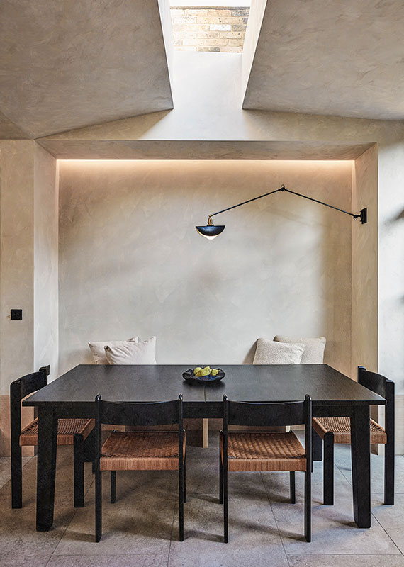
The house features a wealth of richly textured natural materials in a satisfying blend of creams, browns, blacks and greys, and while there are elements of the stark and hard edged, Elliot and Amy’s home is nothing if not warm. You could describe the look as Japandi – calming, casual and organic. I wonder how much of this was the couple’s vision, or was it wholly designer-led? “It was a bit of both,” Elliot explains. “We had a lot of reference images, but would’ve found it difficult to extract details from all of these and apply it to the space in the way that Rees did. Ultimately, one of the core reasons why we chose Rees was down to the common aesthetic of their previous projects, which aligned with our taste. They were able to easily distil our requirements into a design that didn’t fundamentally change as we went through the project, which is testament to the strength of the underlying design principles.”
Such a bold reconfiguration of living spaces has vastly improved the flow of the property and this, in turn, has had a positive effect on the couple’s day-to-day experience. “It’s all moved to the rear of the house,” Elliot says. “We probably spend 80 per cent of our time in here outside of work. We can prep and eat food, watch TV, listen to music, or read in the abundance of natural light that comes in. Now, the traditional living room at the front is used more for special occasions, or as a space to relax with a drink, as it serves as a more ‘smoking room’ type space with its ornate, traditional features, and ambient lighting.”
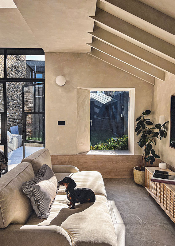
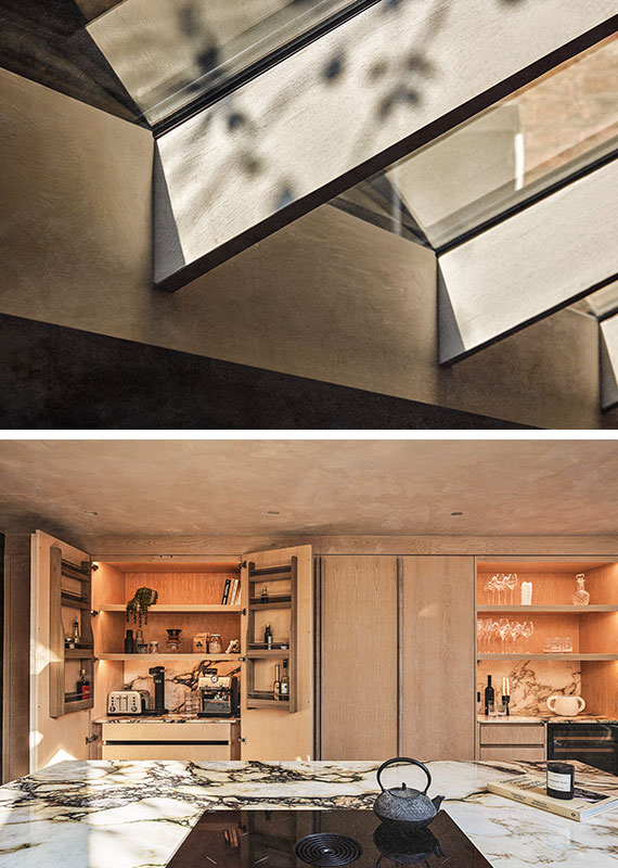
On the subject of light, the property is playfully designed to welcome natural daylight in at every conceivable angle. “The natural light is one of our favourite features of the extension,” Elliot tells me. “The roof light above the dining table is almost church-like and draws you to look up at the sky. It’s a relatively narrow pane, which results in really interesting shadows moving around the room as the sun moves throughout the day. The same can be said for the side return panes, which let an abundance of light through and create warm patches on the ash floor – which is where you’ll usually find the dogs basking!”
Some of Elliot’s stand-out features here include the dramatic marble waterfall worktop, which takes centre stage in the contemporary, wraparound kitchen space. “It’s an exceptional piece of stone,” he says. “One that you couldn’t recreate in a factory. Despite the impracticality of using this type of material next to your hob (note etching from oils!) the effect, as the first thing you see when you walk into the room, is very impactful.” He also loves the bold external metal cladding, an unapologetically industrial addition that creates contrast and dark drama. “This was originally going to be untreated lead, which would naturally patina over time, however we opted for a powder-coated steel in the end, which is more resilient to the elements and looks just as crisp now as it did when it was first installed a year ago.”
A triumph in form and function, the light-filled contemporary extension and refurb has given new life to Elliot and Amy’s period abode. I don’t even need to ask which is Elliot’s favourite space here. “It has to be the open-plan kitchen/living room,” he says. “It’s completely changed the way we live in the house – there’s no reason not to cook now that we have all this space. But I also have to give a special shout out to the utility room, which now houses all that extra ‘stuff’.”
