What’s changed?
We refurbished the property from a two-bed, one-bathroom flat into a three-bed, three-bathroom property with two open courtyard spaces. We took the entire apartment back to a shell and went about altering the structure of the entire building to create a layout that easily flowed from front to back, rather than the inefficient carved-up layout of the original configuration.
That sounds like a lot of structural work
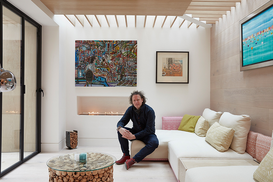
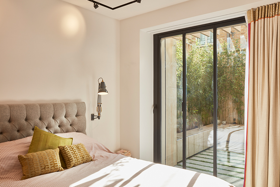
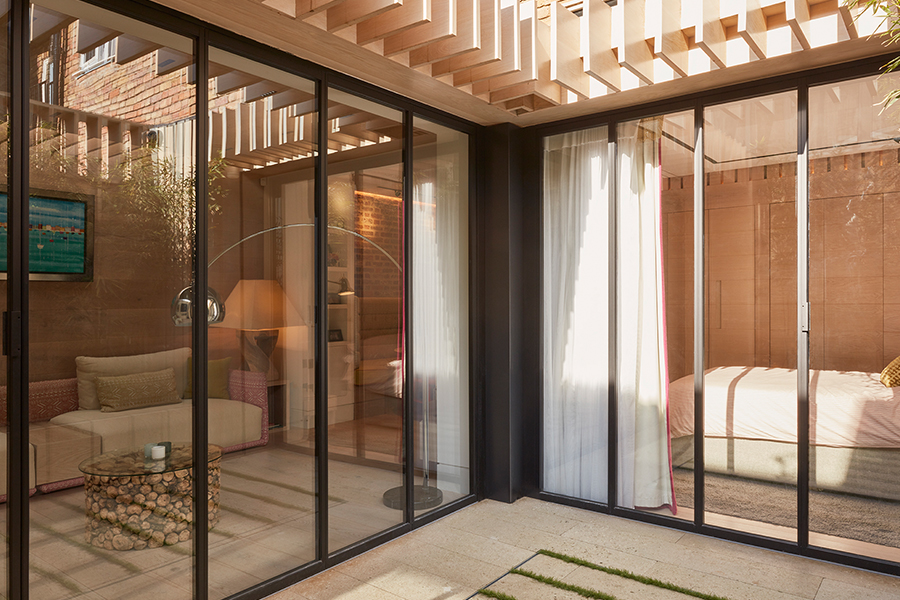
Yes! We lowered the floors to create better floor-to-ceiling heights and integrated three redundant vaults into the layout to provide a cloakroom and an additional bedroom with curved ceilings. We also removed the rear wall to create full-height sliding doors to the master bedroom, whilst extending the apartment to create a new living space, also with full-height doors opening into the timber-lined courtyard.

When were you able to move in?
We’ve owned the property for around four years but moved in 18 months ago, following the refurbishment. This is the family home, which I share with my wife Jess, Ralphie (3) and Bertie (4 months) – I also have two older boys, Alex and Benjy, who frequently come and stay – and not to mention Mr. Purrkins the family cat.
Can you describe the success of the new design?
It’s transformed the space into a fluid layout, which has a generosity of space – liberated from the previous small rooms by removing structural walls to provide a flexibility that embraces its length. The interior adopts clean lines with exposed brick and an abundance of timber floors, walls and ceilings to provide warmth, a softness to the space and a common thematic palette.

How have you maximised on light?
Lighting is hugely important to the success of the interior. Each room has been individually considered with a series of different light sources and settings, curated to provide the visual impression of accent lighting when actually, it provides the ambient source to each space. The kitchen is lit by a bespoke series of blade fittings that were specifically crafted into the flush ceiling, whilst the low-level lighting behind the floating timber walls lights the hall. Natural light is maximized with the use of glass roofs and full-height windows and doors.
Describe your interiors style
In my work, each completed project adds to an eclectic portfolio as it dictates and deserves a unique response to the brief. That said, the binding characteristic of each of our projects – which has definitely manifested itself into our own home – is a pursuit of quality craftsmanship and materials. In terms of favourite brands, we are never too far away from iGuzzini light fittings, Catalano sanitaryware and Gaggenau appliances.

Which room is your favourite?
The garden room is my favourite space within the apartment. It’s where all aspects of the home come together through materials and light. This can be experienced either through the layered framed vista that takes on the overall length of the apartment, or the intimate rustling of the bamboo in the court.
Photography Ed Reeve